Monday, March 29, 2010

Last Little Man card

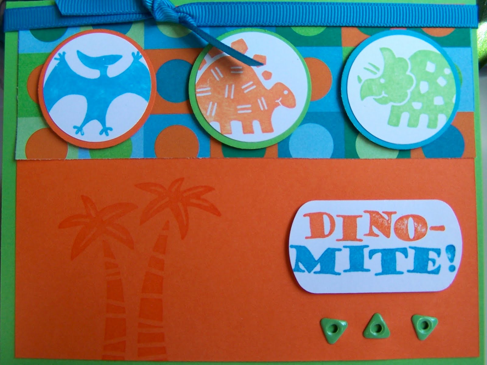
Good morning! Here is my final LM card. I love this set (long retired) and this color combo for little boys. Colors are Only Orange, Tempting Turquoise, and Green Galore. Set is Dinomite. This card didn't turn out quite as I'd hoped, but it's pretty cute anyway and good for small boys I think. I left the inside blank because everyone has a happy birthday stamp, and it could be used as a "way to go" type card as is, maybe for conquering a 2-wheeler or potty training or something like that. Hope you like it, got to get Ems on the bus, then to work!

Sunday, March 28, 2010

Little Man Card # 1

Hi, all! This is my "tween/teen" card for the MAN card swap (I almost wrote just "MAN" swap, but that might give people the wrong idea LOL) This was a really fun card to make--I love the bright colors! The BG is Extreme Elements by SU--FAB set! The main image is Extreme Dirt Bike. I stamped in in Pacific Point and cut it out and mounted it on foam tape. The other colors are Tangerine Tango and Kiwi Kiss. I didn't have a good greeting to go with this so I checked out fonts (free ones, of course!) and went with one called A Bite. I printed "have an extreme birthday" on the inside of the cards. I am SO happy with how this turned out and have all sorts of cards planned for the other stamps in this series (Extreme Snowboard, Surfer, and Guitar to be specific). Plus there are a couple of rock 'n' roll sets by Inkadinkadoo that will look fab with the BG set. And yesterday I was at Mike's and saw some DP with a similar BG and a white dragonfly--so definitely giving that a try! Happy Stamping everyone! Thanks for looking.

Posted by Picasa

Saturday, March 27, 2010

Easter Card

This is the Easter card I made for the shut-in members of our church. It is 8.5 " by 5.5" to make it big enough for the congregation to sign. Card base is Gina K heavy base weight pure white luxury CS. I used a stencil from SU and sponged Certainly Celery, Tempting Turquoise, and Lavender Lace for the flowers. I used my new Embosslits butterfly die from SU on some retired DP and sanded the raised part. I used a Nestie die (the one that looks like an open book, sorry, can't remember which number it is) as a stencil and sponged inside it, then stamped my ODBD Bible verse, Galatians 2:20, inside the sponged area. On the inside is Happy Easter from retired SU set All Year Cheer 1. Posted by PicasaHope you all enjoyed this card--thanks for looking!

Thursday, March 11, 2010

Baby card

Hello! This is a card I made for a family at church that just had a new addition--a sweet baby boy! We did a frozen casserole shower for them--so when she's exhausted from taking care of a newborn all day, she can just thaw, bake and serve! I like this idea and wish it had been done for me with my two. After all, there are only so many bibs and burp cloths one can use! All products here are SU, except the sentiment, which is PTI Bitty Baby Blessings. Giraffe is from SU Wild About You (retired now, boo-hoo! One of the best baby/kid sets ever, IMHO), stamped in Barely Banana. Polka dot paper is LONG retired. CS is Bashful Blue, Certainly Celery, and Barely Banana. This card went together super quick. That often happens with a set you love, because you feel comfortable with it I guess.


Thanks for stopping by today!
Posted by Picasa

Wednesday, March 10, 2010

PTI Regular Card Swap

This was the card I did for the regular card spot in our PTI swap over on SCS, hosted by monkeymama. Since I finished this one I have asked for another spot LOL! Here I used Friends til the End. CS is PTI Plum Pudding and Lavender Moon. I am not crazy about either one of these colors and am using up the first packs I bought, back when they first released these colors. BUT, I like the way this card looks with these colors. BG and Sent are embossed with Iridescent Ice EP from SU. Ribbon is PTI, filigree and rhinestone brad and scallop border punch are all SU. The card is very pretty and sparkly IRL, though I don't think you can tell in the photo. I really like this flower used as a background. Hope you've enjoyed looking!

Posted by Picasa

Tuesday, March 9, 2010

PTI Swap Sketch #1

I got this PTI set, Out of the Box, some time ago and haven't done much with it. I think it's really cute though. And I have had this red, B & W color combo nagging at me for a while. I like how this turned out so bright and cheerful-looking. Sentiment is embossed in white. CS is SU except for base, which is Gina K heavy base weight CS (love that stuff). Ribbon is SU, button is from my stash, tied on with DMC black embroidery floss. Super simple card, follows the sketch from the swap post, HERE.


Have a great day!
Posted by Picasa

Monday, March 8, 2010

Little girl birthday

This card I made for a lady at church who won a free year of handmade cards in our church's Scholarship Fund silent auction. She has a granddaughter with a birthday in March. This is Lily, from Pink Cat Studio's Dress Up Lily set. She comes with all sorts of cute accessories like this crown and sceptre. I stamped her in black on water color paper and watercolored her with an aquapainter and SU reinkers. I added pink stickles to her earrings and crown, and Dazzling Diamonds glitter to the star. DP is by Imaginisce. CS is Pretty in Pink and Regal Rose by SU. I popped up the sceptre on dimensionals. Oh, and that's my new border punch from SU. It gives a super pretty lacy edge.


Hope you get some stamping time today! Thanks for checking in.
Posted by Picasa

Sunday, March 7, 2010

Man Card # 2--Thinking of You

Okay, here is man card # 2. This is a very old SU set called Prehistoric Paintings, which I absolutely LOVE. It makes great man cards. Another good technique to use on man cards is bleaching. Here I used bleach on a couple of the BG stamps in the set on the black layer. In case some of you have never tried this technique, here is what you do (most of this is pretty obvious, but humor me):


1. Work in a well ventilated area. (Duh!) I usually do this outside.
2. Protect your clothes and work surface. (Again with the Duh!)
3. Take a paper towel or 2 and fold to make a pad. Put on a paper plate and pour on some bleach. This is your "stamp pad".
4. Tap stamp on pad and apply to CS. Allow to dry.
5. Clean stamps thoroughly!!! (Once more, with feeling, DUH!)

You will want to experiment with different colors of CS. Bleach gives different effects on diff. colors of CS (Navy turns pink for example). Also, the fresher the bleach, the stronger it is and the more bleached your CS will look. The wetter the bleach pad is, the less defined your image will look. You may want to "stamp off" on scrap paper. AND, I have never done this with clear stamps, nor seen it done. My gut tells me it would ruin them. If anyone knows otherwise, please let me know.

Tearing is another good technique for man cards, as is distressing. And metallic embellishments are good for men as well. What I really wanted was some arrowhead type charms for this card but HL and Mikes didn't have any, and I didn't feel like going looking for bead stores. The card base on this is Gina K, and it is textured like leather--another manly detail. I highly recommend it. Ink is Close to Cocoa and Palette Noir. Sent. is from a retired SU set called Little Hellos.

Hope you enjoyed this card! I have to make 2 cards for the "little man" category, and then they will get mailed off to the amazing cupojafa! Thanks for looking!
Posted by Picasa

Saturday, March 6, 2010

Man Card # 1--Birthday

I'm in a swap over on SplitCoast with some of my PTI swapper friends. We are swapping MAN cards. A lot of people have trouble making masculine cards; not me. I think it's because I have so many brothers. I am attracted to "masculine" images like trees, lighthouses, trains, ships, etc. If you truly have difficulty with "man cards", Becky Oehlers has a post about it HERE with some good advice.


On this card I used a stamp from ODBD called Keep My Lamp Burning. You can find it HERE. I love the collagey feel of this stamp. I looked over the gallery at ODBD and there were several cards that utilized the glow of the light. I tried to figure out how they did it and the best I could come up with is LOTS of masking. So that's what I did. First I punched a hole in a piece of notepad type paper. I used that as a reverse mask and sponged So Saffron ink on my CS. Then I stamped the lighthouse image in Palette Noir Ink. Then I made a mask of the light house and used the circle punched out of my original reverse mask and brayered over the whole thing with Elegant Eggplant and Not Quite Navy. Card base is Sahara Sand, stamped in S. S. with the Canvas BG stamp. Image is mounted on NQN. Eyelets are Bordering Blue (ret.) and rope trim is SU (also ret.) I distressed the edges on the focal image. This card is extremely lumpy because of the knot and would require extra postage and hand canceling if you mailed it. I had such a great time making this card--hope whoever gets one likes it. Thanks for stopping by!
Posted by Picasa